A/B Testing
2020 to present
In this project, I will be talking about co-leading the A/B testing program at the ACLU with one Product Manager.
The program was in its nascent stages when I first started at the org and I was initially hired to find some quick win opportunities to demonstrate the value of testing on improving the ACLU’s revenue. It has since grown into a full program, used to validate product designs, optimize revenue during mission critical times, test business stakeholder strategies, and more. In my time at the ACLU, I have:
Personally designed over 50 experiments netting approximately $1mil in donation revenue lift year over year
Ideated/collaborated on more than 25 other experiments executed by a contractor that led to an additional $500k lift yoy


Process
Quarterly test generation and roadmapping
Though my team is in charge of the prioritization and roadmapping of A/B tests, we strongly believe that good ideas for tests can come from any stakeholder or teammate. I have facilitated quarterly workshops (of varying formats to experiment) with stakeholders to generate new test ideas. The goal is to generate quantity over quality. We've run workshops structured around org priorities, area/zone on the website, and user design principles.
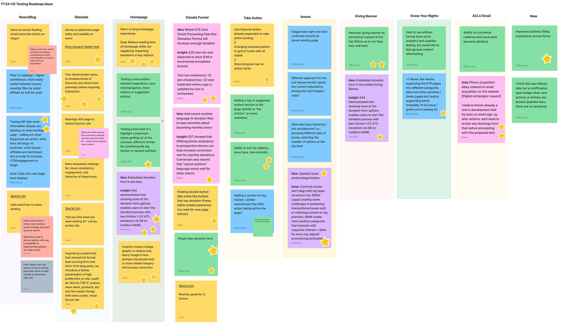
Fundraising case study:
+11.5% Revenue Lift
UI Updates to Improve Affordances and Accessibility
My general process with any A/B test is to work with my PM on a test plan that includes the standard hypotheses and metrics of success, ensuring that the results will help us reach the goal that we want. Sometimes that goal is a learning and sometimes that goal is optimization. If the proposed test is a larger one or involves more than one variable, I workshop ideation and ensure that I am able to isolate learnings.
Problem: Based on previous usability studies conducted by our team, we know that users find the donation flow overwhelming and hard to move through because the form provides no visual hierarchy. Everything is the same color and visual emphasis and thus makes i hard for the eyes to focus on just one thing.
Hypothesis: By updating the donation form and introducing new cues (namely a new color and radii) to interactive elements on the page, users will be given more direction on where to prioritize their interactions and therefore improve conversions.
Exploration
Color
Stroke and radius

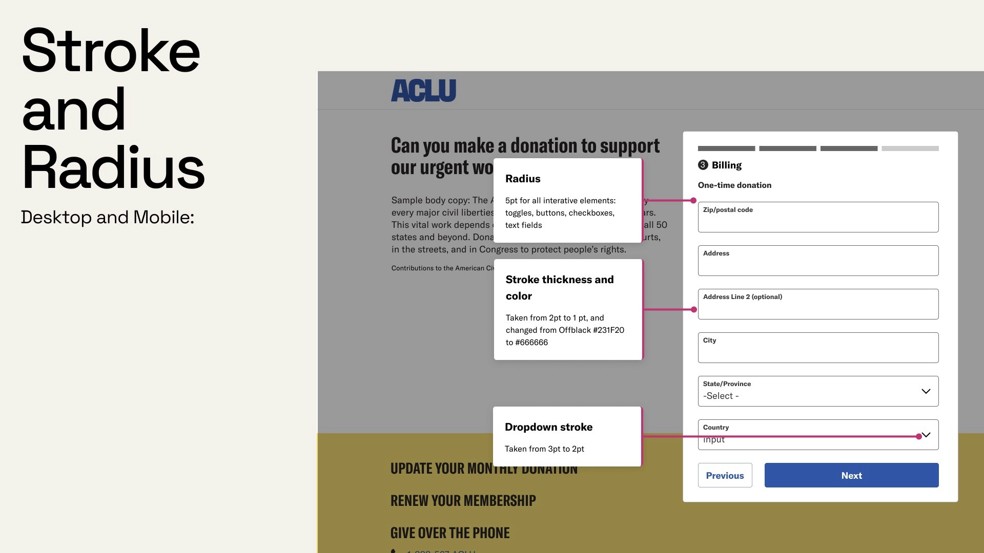
+11.5%
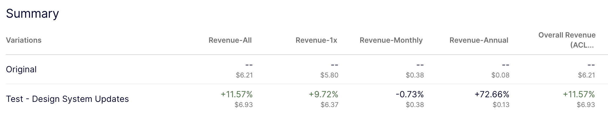
Running the test for 49 days, variation won with an 11.57% increase in overall revenue, including a 72% increase in annual donation revenue.
Some stats included from Optimizely.
Results
Other tests I've designed
Sample mocks below are presented to show breadth of ideation on five other of my most successful tests. I will happily speak about the context and results of any of the tests highlighted.
Implementation and beyond
After a test produces a winner, I am often working with both my developers and other designers to incorporate these winners, whether it be new components or new design principles, to ensure they are implemented in the most sustainable way possible. initially our program was focused on just getting our reps in andcreating test velocity, but now we're able to run 4-5 tests at a time, and so I am shifting my focus to making sure we continue to find ways to implement test winners as the real estate of the website continues to get tighter.
Future questions to explore:
Should we prioritize components based on donations or content engagement?
Can we take test winners and combine learnings into one design or component to save space and create focus for the user?
As the testing program evolves, how can we be more strategic about rolling out multi-phase tests that generate continuous learnings?
More work


A/B Testing
2020 to present
In this project, I will be talking about co-leading the A/B testing program at the ACLU with one Product Manager.
The program was in its nascent stages when I first started at the org and I was initially hired to find some quick win opportunities to demonstrate the value of testing on improving the ACLU’s revenue. It has since grown into a full program, used to validate product designs, optimize revenue during mission critical times, test business stakeholder strategies, and more. In my time at the ACLU, I have:
Personally designed over 50 experiments netting approximately $1mil in donation revenue lift year over year
Ideated/collaborated on more than 25 other experiments executed by a contractor that led to an additional $500k lift yoy
Process
Quarterly test generation and roadmapping
Though my team is in charge of the prioritization and roadmapping of A/B tests, we strongly believe that good ideas for tests can come from any stakeholder or teammate. I have facilitated quarterly workshops (of varying formats to experiment) with stakeholders to generate new test ideas. The goal is to generate quantity over quality. We've run workshops structured around org priorities, area/zone on the website, and user design principles.
Fundraising case study:
+11.5% Revenue Lift
UI Updates to Improve Affordances and Accessibility
My general process with any A/B test is to work with my PM on a test plan that includes the standard hypotheses and metrics of success, ensuring that the results will help us reach the goal that we want. Sometimes that goal is a learning and sometimes that goal is optimization. If the proposed test is a larger one or involves more than one variable, I workshop ideation and ensure that I am able to isolate learnings.
Problem: Based on previous usability studies conducted by our team, we know that users find the donation flow overwhelming and hard to move through because the form provides no visual hierarchy. Everything is the same color and visual emphasis and thus makes i hard for the eyes to focus on just one thing.
Hypothesis: By updating the donation form and introducing new cues (namely a new color and radii) to interactive elements on the page, users will be given more direction on where to prioritize their interactions and therefore improve conversions.
Exploration
Color
Stroke and radius
Results
+11.5%
Running the test for 49 days, variation won with an 11.57% increase in overall revenue, including a 72% increase in annual donation revenue.
Some stats included from Optimizely.
Other tests I've designed
Sample mocks below are presented to show breadth of ideation on five other of my most successful tests. I will happily speak about the context and results of any of the tests highlighted.
Implementation and beyond
After a test produces a winner, I am often working with both my developers and other designers to incorporate these winners, whether it be new components or new design principles, to ensure they are implemented in the most sustainable way possible. initially our program was focused on just getting our reps in andcreating test velocity, but now we're able to run 4-5 tests at a time, and so I am shifting my focus to making sure we continue to find ways to implement test winners as the real estate of the website continues to get tighter.
Future questions to explore:
Should we prioritize components based on donations or content engagement?
Can we take test winners and combine learnings into one design or component to save space and create focus for the user?
As the testing program evolves, how can we be more strategic about rolling out multi-phase tests that generate continuous learnings?
A/B Testing
2020 to present
Role: Design Lead (with a product manager)
In this project, I will be talking about co-leading the A/B testing program at the ACLU with one Product Manager.
The program was in its nascent stages when I first started at the org and I was initially hired to find some quick win opportunities to demonstrate the value of testing on improving the ACLU’s revenue. It has since grown into a full program, used to validate product designs, optimize revenue during mission critical times, test business stakeholder strategies, and more. In my time at the ACLU, I have:
Personally designed over 50 experiments netting approximately $1mil in donation revenue lift year over year
Ideated/collaborated on more than 25 other experiments executed by a contractor that led to an additional $500k lift yoy
Process
Quarterly test generation and roadmapping
Though my team is in charge of the prioritization and roadmapping of A/B tests, we strongly believe that good ideas for tests can come from any stakeholder or teammate. I have facilitated quarterly workshops (of varying formats to experiment) with stakeholders to generate new test ideas. The goal is to generate quantity over quality. We've run workshops structured around org priorities, area/zone on the website, and user design principles.
Fundraising case study:
+11.5% Revenue Lift
UI Updates to Improve Affordances and Accessibility
My general process with any A/B test is to work with my PM on a test plan that includes the standard hypotheses and metrics of success, ensuring that the results will help us reach the goal that we want. Sometimes that goal is a learning and sometimes that goal is optimization. If the proposed test is a larger one or involves more than one variable, I workshop ideation and ensure that I am able to isolate learnings.
Problem: Based on previous usability studies conducted by our team, we know that users find the donation flow overwhelming and hard to move through because the form provides no visual hierarchy. Everything is the same color and visual emphasis and thus makes i hard for the eyes to focus on just one thing.
Hypothesis: By updating the donation form and introducing new cues (namely a new color and radii) to interactive elements on the page, users will be given more direction on where to prioritize their interactions and therefore improve conversions.
Exploration
Color
Stroke and radius
Results
+11.5%
Running the test for 49 days, variation won with an 11.57% increase in overall revenue, including a 72% increase in annual donation revenue.
Some stats included from Optimizely.
Other tests I've designed
Sample mocks below are presented to show breadth of ideation on five other of my most successful tests. I will happily speak about the context and results of any of the tests highlighted.
Implementation and beyond
After a test produces a winner, I am often working with both my developers and other designers to incorporate these winners, whether it be new components or new design principles, to ensure they are implemented in the most sustainable way possible. initially our program was focused on just getting our reps in andcreating test velocity, but now we're able to run 4-5 tests at a time, and so I am shifting my focus to making sure we continue to find ways to implement test winners as the real estate of the website continues to get tighter.
Future questions to explore:
Should we prioritize components based on donations or content engagement?
Can we take test winners and combine learnings into one design or component to save space and create focus for the user?
As the testing program evolves, how can we be more strategic about rolling out multi-phase tests that generate continuous learnings?